
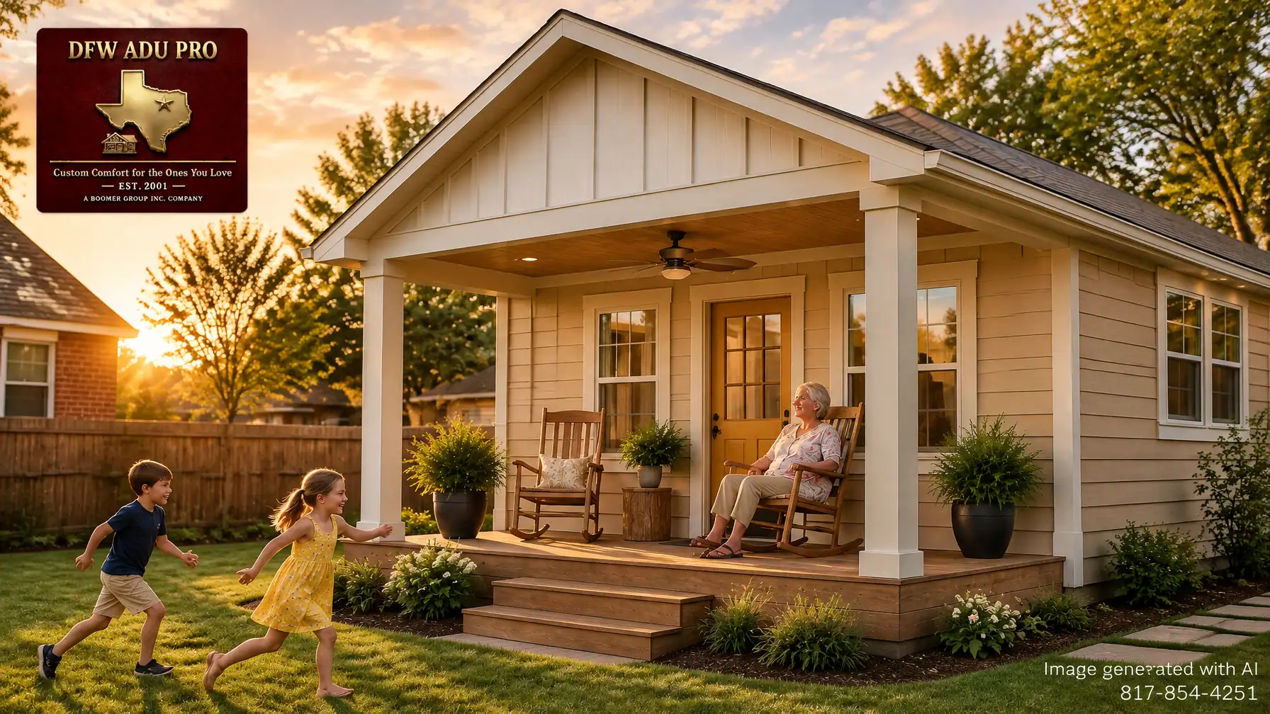
A guest house can be beautifully built and still feel like an afterthought if its exterior colors don’t belong with the main home. The right palette does more than look attractive: it helps a new backyard cottage feel like a natural part of the property, whether it’s an independent home for grandparents, a private in-law suite, or a flexible space for the years ahead.
For homeowners in Tarrant, Denton, and Wise counties, warm Hardie siding tones offer a practical starting point. Think cream, beige, tan, warm gray, and sage, with a little personality at the front door. The goal is not to make the smaller building disappear. It’s to give it a welcoming identity that feels connected to the family home.
Start with a four-part color story
A cohesive exterior palette is easier to manage when you make decisions in order: field color, siding accent, trim, and front door. Each has a job, and together they create a clear visual rhythm.
1. Field color: give the cottage its welcome
Begin with the color that will cover the largest area. In this palette, imagine Oklahoma Cream as the guiding field tone: a soft, warm cream for board-and-batten gables, not a stark white that might look cool beside warm brick or Texas soil.
The precise product color and availability depend on the selected Hardie profile and current local options, so treat Oklahoma Cream as a palette direction rather than an assumed manufacturer color name. The same goes for Artisan Gold below. Check the actual product and finish before finalizing selections.
Cream can brighten a shaded yard and soften the cottage’s overall appearance. It also gives the architecture room to show, especially where vertical boards meet the roofline. This is the kind of board and batten guest house detail that adds definition without relying on a dramatic contrast.
2. Siding accent: ground the design with horizontal lap
Pair the gable with horizontal lap siding in a warm neutral such as beige, tan, or warm gray. Using two siding profiles gives the exterior texture and proportion: vertical boards draw the eye upward, while horizontal lines make the lower walls feel settled and familiar.
A balanced hardie siding adu palette doesn’t need several competing colors. Two related siding tones can do the work, with trim bringing the elements together. For example, try a warm beige across the lower walls, cream on the gable, and a slightly lighter trim. If the main home has a gray roof or cooler stone, compare a warm gray against the beige before deciding; undertones can make two “neutrals” feel surprisingly different side by side.

3. Trim: make the transition feel intentional
Trim is the bridge between siding colors, windows, fascia, and the porch. Keep it consistent around the windows and doors, along the gable edges, and across porch posts and fascia where the design calls for it. Cream trim can connect a light gable to a deeper lap-siding color without creating a hard outline.
This is also where architectural matching makes a difference. A well-considered guest house builder looks beyond the siding sample: roof pitch, eaves, window proportions, brick, and existing trim all affect whether the two structures read as one estate. The aim is a clear family resemblance, not necessarily a copy of every detail.
4. Front door: add one warm point of character
A muted Artisan Gold door can give the cottage a friendly focal point, especially against cream trim and beige siding. Use the accent sparingly. It may work on the front door and selected porch trim, while leaving other trim elements quieter.
A front porch adu should feel inviting in real life, not just in a photo. A covered entry, ceiling fan, rocking chairs, and potted plants make the porch useful in North Texas heat and give relatives a comfortable place to sit. With a granny flat or in-law suite, small choices like a welcoming door color can help the space feel personal and independent.
Put samples on the walls, not just on a screen
North Texas light changes the way exterior color reads. A cream that looks soft on a phone may appear much brighter in direct sun. Beige can take on a gray cast in shade; a warm accent may look more saturated at dusk.
Order or obtain physical samples for the exact siding product and finish you’re considering. Then view them against the actual home or exterior materials, ideally on more than one side of the house:
- Check the samples in morning sun.
- Revisit them in afternoon shade.
- Look again at dusk, when warm light can deepen color.
- Compare them beside the roof, brick, stone, window frames, and trim.
James Hardie likewise recommends viewing physical samples and coordinating siding with fixed elements such as roofing, brick, and stone. Its exterior color-selection guidance explains why light and existing materials matter when choosing a palette. A digital rendering can help you narrow choices, but it shouldn’t make the final call.

Make the guest house feel like it belongs
Before settling on a palette, step back and look at the whole property. What color is the main home’s roof? Does its brick lean orange, red, or brown? Are the existing window frames bright white, cream, or dark? Which colors already appear in the landscaping, fencing, and hardscape?
The guest house doesn’t have to match every surface exactly. Instead, repeat a few visual cues: a similar trim color, related roof tone, or the same warm family of neutrals. That continuity helps a detached structure feel like a permanent extension of the home rather than a separate project placed in the backyard.
This is especially useful for multigenerational home additions Keller homeowners may be considering, as well as families throughout the surrounding North Texas communities. Whether the intended use is independent living for aging parents, a quiet space for an adult child, or flexible family accommodation, the exterior should feel comfortable to the people who will call it home.
Don’t leave HOA review until the end
Many North Texas communities have architectural-review requirements for exterior changes, and the specific rules vary by neighborhood. Before committing to a palette or ordering materials, check the HOA covenants and submission process. Some associations may request color names, physical samples, elevations, photos, or details about the siding profile.
Bring the palette forward early enough to make revisions without disrupting design decisions. A clear submission can show the proposed field color, gable accent, trim, and front door, along with how they relate to the primary home. Approval requirements are community-specific, so confirm them directly rather than assuming a color that looks appropriate will automatically be accepted.
Color is part of a complete build decision
A front porch adu in warm cream and beige may be the look you picture, but exterior selections need to fit the design, property, and construction plan. DFW ADU Pro, a division of Boomer Group Inc., has served North Texas since 2001, with experience in Tarrant, Denton, and Wise counties. Its PRO Construction affiliate ranks in the top 1% among Texas contractors based on verified permit history.
The team provides turnkey design and full permit management, with structural permanence built around slab foundations. The goal is a durable backyard cottage with seamless architectural matching, not a short-term-looking structure that feels disconnected from the main home.
For planning purposes, 500 sq. ft. plans commonly begin around $125,000–$150,000. Total project costs vary based on site conditions, utilities, foundation, size, and finish level. Color selection is one piece of the bigger picture, alongside feasibility, design, city requirements, HOA review, and construction scope.
Explore DFW ADU Pro’s services, learn more about the Keller guest house builder, or request an estimate. To discuss a project, call 817-854-4251 or email info@dfwadupro.com.
A warm palette is at its best when it serves the family living there: a front door that feels welcoming, siding that complements the main home, and a shaded porch where Grandma can watch the kids play. Choose the colors in the real North Texas light, confirm the details with your HOA, and let the finished guest house feel like it has always belonged.
Project disclaimer: Local zoning, permitting, HOA covenants, lot requirements, setbacks, utilities, and occupancy rules must be verified before quoting specifics.
A division of Boomer Group Inc.
Leave a Reply